Sunday, June 22, 2014

2014 Upper Deck Football Blaster Box Break #1

I picked up a blaster box of 2014 Upper Deck Football.  I haven't opened a blaster before.  I have opened up a hobby box of this product and liked it a lot so I figured I'd give the blasters a try too.

The blasters are a little expensive.  They're $19.99 plus tax, for 35 cards and a bonus pack of Johnny Manziel career highlight cards (5 cards).  That's basically $20 for 40 cards, or about 50 cents per card.  That is pretty steep for a low end retail product.  But on the plus side, the blaster box does guarantee you over 35 rookie cards in the blaster.  In other words, you're not going to get a ton of worthless veteran base cards. 


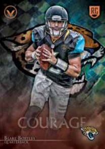
The only notable cards I got were a Blake Bortles rookie card, and a Jordan Lynch rookie card.  I don't have either of those yet, so I was glad to get those rookie QBs. 


I was pretty lucky and also got one SSP card and one SP card.  The SSP card was a Aaron Colvin rookie card, and the SP card was a Martavis Bryant rookie card.  I actually got a SP Martavis Bryant rookie card in my hobby box, so now I have two.

The Johnny Manziel cards were unremarkable.  I don't think they're really true rookie cards so I'll probably sell them. 

Overall, not a bad break.  I got lots of rookie cards, one top QB draft draft pick, a SP rookie card, and a SSP rookie card.  There are worse ways to spend $20.  I can live with the outcome of this blaster. 

Wednesday, June 18, 2014

2014 Upper Deck Football Box Break #1

I bought myself a hobby box of 2014 Upper Deck Football.  I bought this box off of Blowout Cards for about $90.  The price is a little on the high side for what I think it should be, but I wanted to bust some 2014 product.  Anyways, here's the damage.    

Notable Base Rookie Cards:
Johnny Manziel
Sammy Watkins SP (not pictured)
Jimmy Garoppolo
Tom Savage
Martavis Bryant SP


1994 UD Tribute Star Rookie Inserts:
Marion Grice 
Stephen Morris
Taylor Lewan

College Tribute:
Penn State's White Out


UD Authentics:
Blake Bortles
Bruce Ellington
Jeff Mathews (not pictured)


Upper Deck Letterman:
James White (New England Patriots, 4th Round, 130th Overall)
Stephen Morris (Undrafted)


Rookie Autographs:
Devin Street (Dallas Cowboys, 5th Round, 146th overall)


Post-Break Thoughts: 

Overall, I think this was an "okay" box.  My hits weren't great.  Stephen Morris went undrafted in the 2014 NFL Draft.  It always sucks when one of your hits is an undrafted free agent.  Devin Street isn't a big name, nor is James White.  I wasn't expecting, but I sure was hoping to get at least one big name hit in the box. 

On the other hand, the inserts weren't bad at all.  I did well on the UD Authentics, getting three of them in this box.  I think most boxes only have one or two.  Even better, two out of three were big name players.  Obviously, Bortles is a good guy to get, and Bruce Ellington is supposedly to be a baller. 

The College Tribute cards are cool, and I'm lucky to get one in my box, but I'll probably sell the White Out. 

Would I buy another box of this?  Yes, but only at the right price.  I definitely wouldn't pay more than $100 for a box of this.  A fairer price point is probably around $80.00.

Sunday, June 8, 2014

BGS Grading Tip: Ink on Edge Will Result in Low Grade

I was watching a BGS mailday video by UltimateBoxBreaks.com and came across something really interesting. 

One of the cards that was sent in was a Denarius Moore 2011 Panini Prime Signatures 1/1.  Unfortunately, that card came back with a final BGS grade of 5.0!


What in the world caused it to get such a low grade?!   Well, BGS was nice enough to include a note with the card stating why its final grade was so low.  It was because there was ink on one of the edges.


Here's a screen-grab one the ink on the edge.  I've circled it in red.  It's actually a very small ink mark.  It looks like the player (or maybe the owner of the card) accidentally nicked one of the edges of the card with either a sharpie or a ball point pen.  Either way, the results is a really really, and I mean really, bad edges subgrade.

I even looked up the BGS grade online.  Here it is.


The edges got a 4!  This just goes to show how careful you have to be handling your cards, and inspecting them for flaws before you send them in.

(And as a side note, it is worth noting that the card's final grade was a whole 1.0 higher than its lowest subgrade, which is a rare exception to the general rule that you can only get 0.5 higher than your lowest subgrade.  Check out this Beckett BGS Grading blog post for more information on that.)

Now, I've already blogged about the ink stain problems on 2013 Topps Five Star Football cards.  Imagine if you sent one of those cards in for BGS grading.  You'd probably get just as low of a grade, or perhaps even a lower grade.  I've seen some 2013 Topps Five Star Football cards with big time ink stains on the corner edges -- much bigger than that little ink mark on this Denarius Moore card.  It would be such a shame if you hit a really nice card in your box of 2013 Topps Five Star Football only to find out that it had ink stains on one of the corners.  Since you would only expect that card to get a final BGS grad of about 5.0, then its value would be incredibly diminished.

UPDATE:  Since I wrote this blog post, UltimateBoxBreaks.com did another Beckett BGS Grading mailday video, and two 2013 Topps Five Star Football cards came back upgraded because of ink stained corners.   Apparently the ink stained corners were so bad that BGS didn't want to grade them.  I'm assuming that the grades the cards would have received would be even less than a 4.0. 

Thursday, May 29, 2014

2014 NFLPA Rookie Premiere & 2014 Topps Inception Football Preview

The 2014 NFL Players Association Rookie Premiere is currently underway in Los Angeles.  Fortunately for us card collectors, Topps has been posting some good pictures of the upcoming releases on their Twitter feed.  Below are some of the pictures.

2014 Topps Inception Football Inscription Card

I actually grabbed the above picture from a video.  It shows what the new 2014 Topps Inception Football inscription cards will look like.  I think they look awesome.  I like the ornate gold foil inlay which frames the team logo, and which is underneath the player name.  It's smart of Topps to only put gloss on the actual player image rather than over the entire card.  By not putting gloss on the area where the player will sign this helps ensure that the autograph doesn't smear or scratch off so easily. 


This one is actually a preview of 2014 Bowman Football.  The cards are a little hard to see but from you can see they do look very nice. 


Brandin Cooks is showing off a old school mini.  Notice all the jerseys stacked up behind him?  That is why I don't usually buy or pay a premium for rookie year patch autograph cards.  Those jerseys will hardly be touched by the players.  At the most, each will be worn for minutes or mere moments just so the card companies can claim them as being "event used" or "player worn." 


 Another Inception preview, with tons of jerseys stacked in the background.


Overall, the cards Inception cards look pretty nice.  Obviously, the biggest draw for Inception is that it will be the first high-end release for the 2014 NFL rookie class and it will have tons of on-card autographs.  Unfortunately, some of the players are depicted on their cards as wearing number "00", which is because they haven't been assigned a number yet by their team. 

Friday, May 23, 2014

2014 Topps Valor Football Preview

Topps Valor will be returning in 2014 after taking a year off after its debut year in 2012.  I was probably only one of three people on Earth who liked 2012 Topps Valor Football.  I thought the theme was cool, the cards looked beautiful, and I loved all the on-card rookie autographs.  Oh, and the tins were awesome also. 

Unfortunately, while the cards were great in theory and looked awesome, the execution was a little sub-par.  First of all, the checklist was lopsided and a little weak.  Most notably, Russell Wilson autographs were missing from the product.  Many NFL teams were not even represented on the checklist at all.  The price for a hobby box was way too expensive too.  Even presently, at a very reduced price of about $130 a box (via Blowoutcards.com), I think it's still too expensive to break for only two rookie autographs, one veteran autograph, and one patch card.  That's about $43 per autograph, or about $32.50 per hit.  Finally, way too many of the cards suffered from really really REALLY bad corner and edge damage. 

I was really hoping to see Valor return in 2013, but it didn't.  Perhaps Topps was taking some time to re-think what they wanted to do with this product before bringing it back in 2014. 

Well, it's 2014, and Valor is back.  How does it look?  The first previews have me concerned.


The 2014 mockups look way different than the 2012 cards.  Change isn't always a bad thing, so long as it's for the better, but I'm not so sure this is for the better. 

The first thing which jumps out at you is the background image.  Now instead of a fairly blank background the 2014 background will be the team logo on a checkered design.  This change wouldn't be so horrible if it stayed within the whole gladiator theme, but I don't think it does.  The 2012 cards had a very subtle sky and coliseum background image on the cards which -- in my opinion -- did induce mental images of ancient gladiators, swords, and awesome movie scenes from the movie Gladiator.  This logo and checked background doesn't make me think about gladiators at all.

The second thing which worries me are the sticker autographs.  Maybe Topps will get the players to sign on-card and the stickers in the previews are there just as a precaution, but one of the great things about the 2012 Valor set were the on-card rookie autographs.  Topps needs to continue the on-card trend. 


The patch autographs look awesome.  You can clearly see the whole gladiator shield design element working well with this cards. 


The gladiator theme continues very nicely on the patch cards.  While the patches do look very reminiscent of Supreme patch cards, the design element is nice and ancient Roman feeling. 

Perhaps the biggest change to Valor will be the pack-out format.  Instead of one tin of only six cards, it's now going to be a 20 pack box, four hits per box (autograph, autograph relic, jumbo relic, and patch card), and the base set will now be a whopping 200 cards!  This change seems to signal Topps' intent to make this product more of a collectible middle-end product rather than a high-end product.  I'm not against this move but I hope Topps continues to focus on the quality of the product.  The 2014 base checklist should include all 32 NFL teams.  It should have hits for every NFL team.  All the top 2014 rookies should have autographs in the product.  The price point should be cheaper.  And the cards need to be packed in better manner such that they don't all suffer edge and corner damage. 

The Valor product line has huge potential, in my opinion.  Topps needs to address the problems which kept so many people from buying it in 2012.  If they're able to do that, then I think they'll have another successful product to add to their already impressive list of successful products. 

Thursday, May 22, 2014

Sports Card Thickness

If you haven't checked out BCW's blog, you should.  They have some great tips on their blog and plenty of information about their products.  One great blog post is the one on card thickness.  If you can always remember the below tips, you'll never have a problem with knowing what thickness magnetic or toploader that you need for your cards!

  • A regular sports card is about 20 points thick.
  • A regular Topps base card is about 18 points thick.
  • A card sleeve is about 4 points thick.

Basically, all you need to remember is that your typical sports card is 18 to 20 points thick!  If you can remember that, and you have some extra base cards lying around, you can always figure out the exact thickness of a card by stacking those base cards next to it.  This is a great way to figure out what size and thickness magnetics and toploaders you need. 

Wednesday, May 21, 2014

BGS Beckett Grading Tip: Centering

Of the four Becket Grading Service (BGS) subgrades -- centering, corners, edges, and surface -- the card's centering should be the easiest for you to evaluate on your own.  The only tool you're really need is a ruler.

It's important to keep in mind what makes for a good centering subgrade.  Beckett's own website provides guidance on this issue:

Pristine 10 centering must be: "50/50 all around on the front and 60/40 or better on the back."  

Gem Mint 9.5 centering must be: "50/50 one way, 55/45 the other way on the front, and 60/40 or better on the back."

Mint 9.0 centering must be: "55/45 both ways on the front, and 60/40 or better on the back."  

Understanding what the above language means is critical to making sure you're only submitting cards for grading which should receive a 10 or 9.5 on its centering subgrade.

The first important note to take away from the above language is that the card's front centering is way more important to obtaining a good centering subgrade than the card's back centering.  Even with 60/40 centering on the back of the card you still can get a 9.0, 9.5 or 10 subgrade on the centering subgrade depending on the card's front centering.

The second important note to take away from the above language is that to get a centering subgrade of 10, the card's front centering must be 50/50 all around on the front.  This means that the card should not be off-centered left to right or top to bottom.

The third important note to take away from the above language is that if the front of your card is off-centered both left to right and top to bottom, then you can only get as high as a 9.0 subgrade on centering (although you certainly might get lower).  A subgrade of 9.0 on centering allows for the card's front centering to be off both ways, but only by a small margin of 55/45 both ways.  However, to get a subgrade of 9.5 on centering then the card's front centering must be 50/50 one way and only 55/45 the other way.

In conclusion, if your card is off-centered on the front in both directions, meaning top/bottom and left/right, then there is no way you're going to get a 9.5 subgrade on centering.  Most likely you're going to get a subgrade of 9.0 or less on centering.  This can hurt your overall grade significantly as since the general BGS rule is that your final grade cannot be more than 0.5 higher than your lowest subgrade.  (I've covered the basics of the BGS grading formula in this previous post.)

Centering is one of the easiest subgrades for you to control and measure when you're buying cards either on eBay or COMC.  If I'm buying a card on eBay or COMC which I would like to submit for BGS grading, then I am very careful to evaluate its centering in the pictures or scans.  Since COMC uses high quality scans on their website, this makes measuring centering very easy.  I'll often enlarge the scans and use a ruler to measure the centering on the card to make sure it will garner a high subgrade.

Keep the above tips in mind when choosing cards to submit for BGS grading.  There should be no excuses for not getting a 9.5 or higher on your cards' centering subgrade if you know the BGS grading criteria and are careful to evaluate your card's centering.